How to Draw Realistic Cars: Step-by-Step Guide
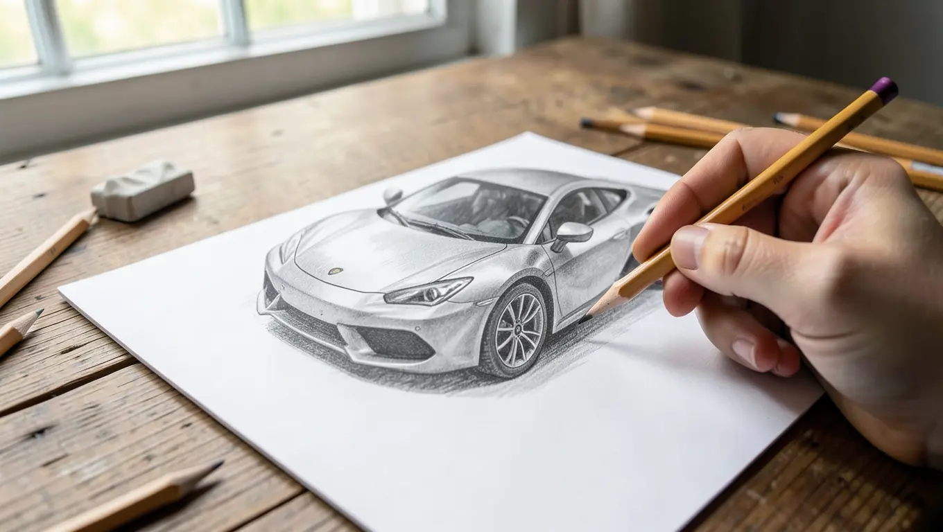
You draw a realistic car by working from simple shapes to a proportion “box,” not by starting with details like headlights or grille lines. Every convincing car drawing follows the same order: block in the overall silhouette, lock the proportions to a reference photo, then layer in perspective, details, and shading last.
Most beginner car drawings fail for one of two reasons: the proportions are off before a single detail gets added, or the shading is flat because it ignores where the light source actually sits. Fix those two things and a drawing goes from “car-shaped” to genuinely realistic, even with basic graphite pencils.
This guide covers the tools worth buying, how to block in accurate proportions with the box method, drawing in perspective, adding details like headlights and wheels, shading and blending for depth, and the mistakes that flatten an otherwise solid sketch.
Tools You Need to Draw Realistic Cars
You do not need an expensive kit to start. A graphite pencil set, a decent eraser, and smooth paper cover almost everything in this guide. Pencil hardness is graded on a scale from 9H (hardest, lightest line) through HB (the middle) to 9B (softest, darkest line). For car drawings, you will lean on three or four grades rather than the full set:
| Pencil Grade | Best Use on a Car Drawing |
|---|---|
| 2H–4H | Light construction lines, the proportion box, initial outline |
| HB–2B | Body outline, panel gaps, mid-tone shading |
| 4B–6B | Dark shadows under the car, deep tire tread, glass interior |
| 8B–9B (optional) | Near-black accents like tire sidewalls or window tint |
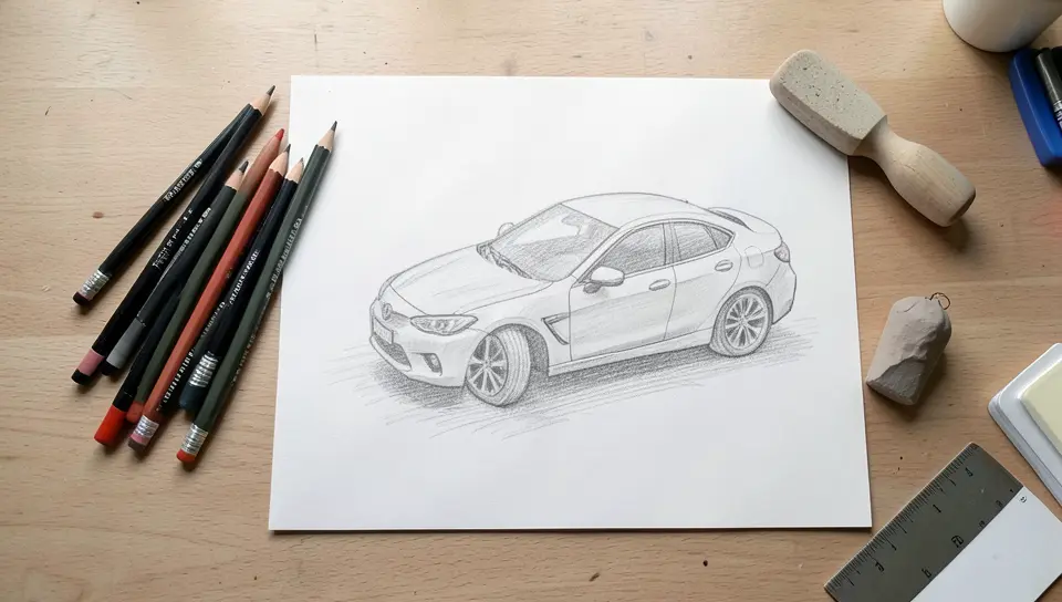
Beyond pencils, four things matter more than most beginners expect. A kneaded eraser lifts graphite cleanly without smudging, which makes it the right tool for pulling out highlights on glass and chrome rather than a standard rubber eraser. A blending stump (a tightly rolled paper stick) smooths graphite into even gradients on painted body panels. Smooth or “hot press” paper holds fine detail better than toothy sketch paper, which is worth it once you move past rough practice sketches. And a reference photo is not optional — even experienced car illustrators work from a photo or a clear mental image of a specific angle, because cars have precise proportions that are hard to invent from memory.
STARTER PENCIL SET FOR CAR SKETCHES
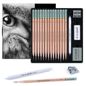 |
KALOUR 18-Piece Professional Sketch Pencil Set – $6.99 Covers the 5H–14B range this guide walks through, plus a kneaded eraser and blending stump in one set — useful if you do not already own graded pencils.
|
Understand Car Proportions Before You Sketch a Line
Proportion problems are the single biggest reason a car drawing looks “off” even when every individual detail is drawn well. Cars follow fairly consistent ratios: the wheel diameter is roughly one-third of the car’s total body height, the wheelbase (distance between the front and rear axles) is usually a little more than half the car’s overall length, and the greenhouse (the window area) sits in the upper third of the body.
Start every drawing with a simple bounding box — a rectangle that matches the car’s overall length and height from your reference photo. Draw this lightly with a 2H or 4H pencil, since it is a construction line you will erase later. Inside that box, mark the wheel centers, the beltline (where the body meets the windows), and the roofline. Every other detail gets measured against these marks rather than guessed freehand, which is what keeps the final drawing looking like a specific, real car instead of a generic car shape.
Block In the Basic Shape With the Box Method
- Draw circles for the wheels first, sized and spaced using the proportion box from the previous step.
- Sketch a rectangle for the main body mass, then round the corners into the rough silhouette of the hood, roof, and trunk.
- Add light guideline curves for the hood line, beltline, and roofline — these should connect smoothly, not as sharp angles.
- Block in the window openings as simplified trapezoids before refining their exact curves.
- Keep every line light at this stage. You are still checking proportions, not committing to a final outline.
Once the basic shapes line up with your reference, darken the lines you are keeping with an HB or 2B pencil and erase the rest. Straight lines work for hard edges like a hood crease or door seam; curved, slightly varying pressure works better for the sleeker parts of the body, like a fender arch or a rear haunch, where a perfectly even line reads as stiff and unrealistic.
Draw Cars in Perspective (One-Point and Two-Point)
A car drawn dead-on from the side needs no perspective at all — it is a flat elevation view. Almost every other angle needs it, and the type depends on the view:
- One-point perspective works for a near-straight front or rear three-quarter view, where all the receding lines (the sides of the hood, the roofline, the door panels) converge toward a single vanishing point on the horizon.
- Two-point perspective is what most “hero shot” car drawings use — a corner three-quarter view where the front and side of the car recede to two separate vanishing points on the same horizon line.
Set your horizon line first, then place one or two vanishing points on it. Draw the car’s key structural lines — the beltline, the roofline, the bottom of the doors — so they all point toward the correct vanishing point. This is what makes wheels look properly elliptical instead of circular from an angle, and what keeps the hood from looking like it is floating above the front bumper. Practicing the same car from a low angle and then a high angle is the fastest way to internalize how much the proportions visually shift with viewpoint, even though the actual car has not changed.
Add the Details That Make a Car Look Real
Details should always come after the shape and proportions are locked in, not before. Headlights are usually round or oval clusters — sketch the outer housing shape first, then add smaller circles inside for the bulb or projector lens, and leave a small untouched highlight where the glass reflects light. Grilles read as believable once they have a consistent pattern (horizontal slats, a mesh, or vertical bars) rather than random scribbled lines; draw a light guide grid first, then commit to the pattern.
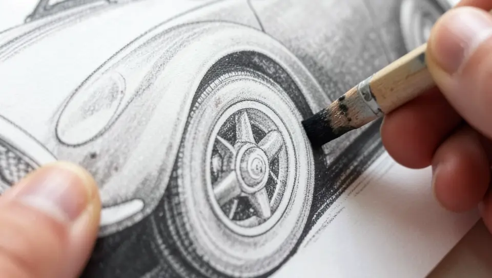
Wheels benefit from the same box-method thinking as the whole car. Start with the outer tire circle, then a smaller circle for the rim, then the spoke or mesh pattern radiating from the center hub. Keep tire tread as short, slightly irregular dark marks rather than a perfectly even pattern — real tread has wear and variation. Match the size of both wheels carefully; mismatched wheel sizes are one of the fastest ways to make an otherwise good drawing look amateurish, since the eye catches that asymmetry immediately.
Shading Techniques That Create Depth
Shading is what separates a technically accurate line drawing from something that reads as a real, dimensional car. Pick one light source and stay consistent with it for the entire drawing — most reference photos make this obvious from the cast shadow on the ground. Every surface facing that light source stays lighter; every surface angled away from it goes darker, and the surfaces directly opposite the light source (the underside of the car, the inside of wheel wells) get your darkest tones.
Painted body panels are smooth, so shade them with even, overlapping strokes and blend with a stump or tissue for a soft gradient — hard, visible pencil lines read as texture, not smooth paint. Glass and chrome are the opposite: they need sharp, high-contrast highlights (often lifted out with a kneaded eraser) right next to very dark shadow, because reflective surfaces bounce light in hard-edged patches rather than soft gradients. Tires and rubber trim need small, slightly random short strokes instead of smooth shading, since rubber has a matte, textured surface. As a rule of thumb, draw closer parts of the car with slightly heavier, more defined lines and distant parts with lighter, softer ones — that contrast alone adds a sense of depth before any shading is even applied.
Coloring and Blending for a Finished Look
If you are moving beyond graphite into color, keep the palette restrained — three or four related shades per panel color usually reads more realistically than a wide range, since real automotive paint has a limited number of visible tone shifts under normal light. Test colors on a scrap of the same paper first; colors often look different once they are actually blended on the page than they do in the pack.
Layer from light to dark rather than trying to get the final tone in one pass. Lay down a light base coat across the whole panel, then build darker shades into the shadow areas on top of it, blending each layer with a blending stick, cotton swab, or your finger before adding the next. Small circular motions blend more evenly than back-and-forth strokes and avoid visible streaking, especially on larger flat panels like doors and hoods.
Common Mistakes That Kill Realism
- Adding detail before fixing proportions. A drawing with perfect headlights but a wheelbase that is subtly too short will always look wrong, no matter how much detail work goes into the rest of it.
- Uniform, mechanical outlines. Every line drawn at the same weight and pressure looks like a technical diagram, not a car. Vary line weight based on distance and edge sharpness.
- Skipping the cast shadow. A car with no shadow underneath it looks like it is floating. The contact shadow where the tires meet the ground is one of the most important cues for making a drawing feel grounded.
- Flat, single-tone reflective surfaces. Chrome, glass, and glossy paint all need sharp highlight-to-shadow contrast, not one even gray tone.
- Ignoring the reference photo’s actual angle. Guessing at a three-quarter view without a real reference almost always produces subtly wrong perspective that is hard to self-diagnose.
Highlighting Edges and Reflections
Final highlights are what make a shiny surface look shiny. Use a kneaded eraser pressed and lifted (not rubbed) to pull clean highlight streaks out of already-shaded chrome trim, window glass, and body panel edges where light hits directly. Keep these highlights sparse and deliberate — a car covered in highlights looks overworked rather than reflective. On windows and painted panels, add a faint suggestion of the environment reflecting back (a lighter streak suggesting sky, a darker patch suggesting nearby trees or buildings) rather than a literal reflected scene; it reads as more convincing than it sounds.
How to Practice So You Actually Improve
Short, consistent practice beats occasional long sessions. Even 20–30 minutes a day of deliberate practice — not just doodling, but working from a reference and checking proportions — builds the muscle memory for line control faster than an occasional multi-hour session. Keep every sketch, even the bad ones, in one sketchbook. Flipping back through weeks of drawings is the clearest way to see real progress, which is easy to miss day to day.
Study real cars whenever you can, not just photos. Notice how light actually falls across curved panels in different weather, how a wet car’s reflections differ from a dry one, and how wheel wells and mirrors interrupt the body’s smooth lines. Photograph cars you see from angles you find difficult and use them as reference material later. Redrawing the same car from front, side, and three-quarter views is one of the most effective single exercises for understanding how its proportions hold up from every angle, not just the one you happened to draw first.
Frequently Asked Questions
How do you draw a realistic car step by step?
Start with a light proportion box based on a reference photo, then block in circles for the wheels and a rounded rectangle for the body. Refine the outline once the proportions check out, add details like headlights, grille, and wheel spokes, then shade with a consistent light source before finishing with erased highlights on glass and chrome.
What is the easiest car to draw for beginners?
The Volkswagen Beetle is a common beginner pick because its rounded, simple silhouette has fewer sharp creases and complex panel lines than most modern cars. Boxy hatchbacks and older muscle cars with flat body panels are also easier starting points than curvy modern sports cars, which have a lot of subtle surface detail to get wrong.
Where do you start when drawing a car?
Start with a proportion box, not a detail. Measure the car’s overall length and height from a reference photo, sketch that as a light rectangle, then mark the wheel centers, beltline, and roofline inside it before drawing a single curve of the body. Skipping straight to headlights or grille details is the most common reason beginner car drawings end up with wrong proportions.
How do you get good at drawing cars?
Practice regularly using real reference photos rather than drawing from memory, and focus on proportions before details every time. Study how light and shadow behave on curved, reflective surfaces specifically, since that is different from shading most other subjects. Redrawing the same car from multiple angles and reviewing your older sketches for recurring mistakes speeds up improvement more than sheer volume of drawings alone.
Do you need a reference photo to draw a realistic car?
Practically, yes. Cars have precise, consistent proportions — wheel size relative to body height, wheelbase relative to overall length, window placement — that are extremely difficult to invent accurately from memory. Even professional automotive illustrators work from photos or detailed sketches rather than drawing an unfamiliar car purely from imagination.
What is the best paper for a realistic car pencil drawing?
Smooth, heavier-weight paper (often labeled “hot press” or “smooth” bristol) holds fine detail and blending better than toothy, textured sketch paper. Textured paper is fine for loose practice sketches, but a finished realistic drawing with sharp highlights on glass and chrome benefits from a smoother surface that does not break up graphite blending with visible paper grain.
Conclusion
Realistic car drawing comes down to sequence more than raw talent: lock proportions first with a box method and a real reference, build the shape and perspective before any details, then shade with one consistent light source and save sharp highlights for glass and chrome at the very end. Every step in this guide builds on the one before it, so resist the urge to jump straight to details on a fresh sketch.
Keep a sketchbook of every attempt, even the rough ones, and revisit the same car from a few different angles as you improve. Progress in car drawing tends to show up in proportion accuracy and shading control long before it shows up in any single “finished” piece, so track it across a body of work, not one drawing at a time.
Products related to this article
Sponsored / affiliate links. As an Amazon Associate I earn from qualifying purchases. I may earn additional commission from eligible campaigns.